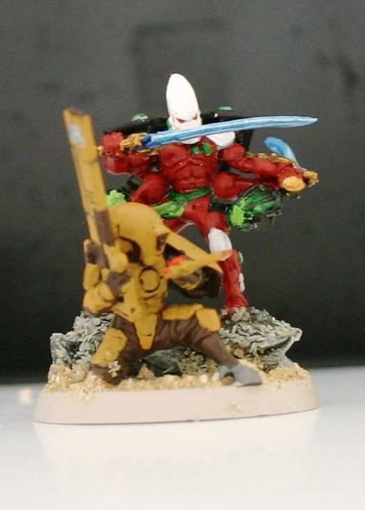
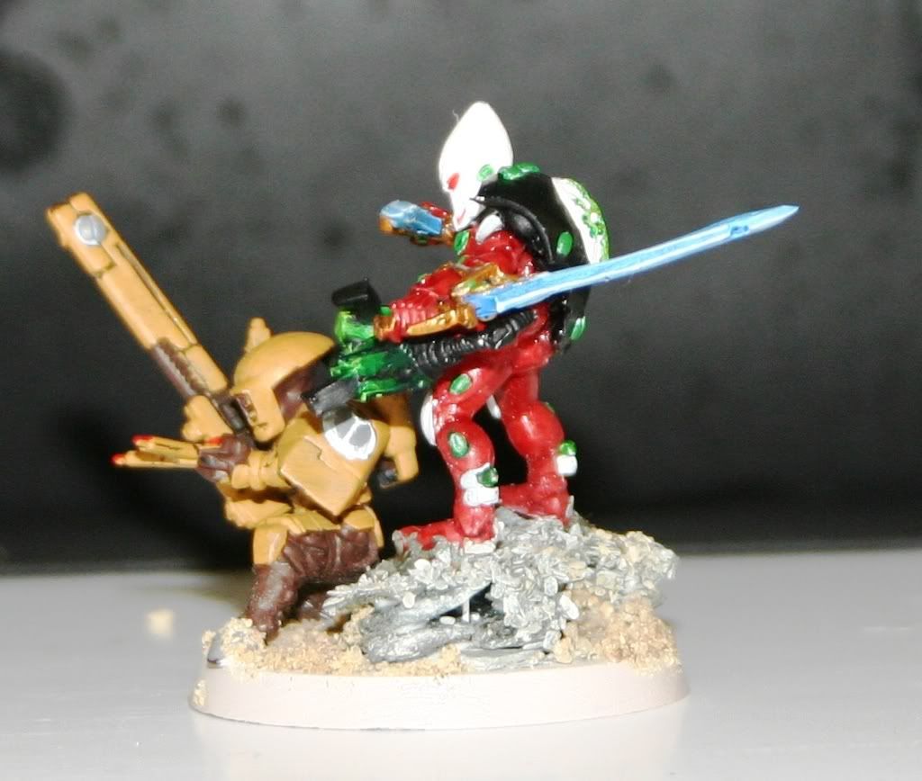
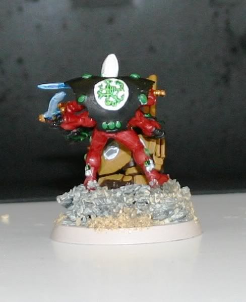
So, the larger purpose of this blog entry is a request for feedback.I finally received the final scores from the tournament referenced in my previous post. The organizer was also kind enough to send me the scoring criteria used for each of the areas. I will have to wait for a full picture of my army before getting feedback on the Overall Army, but in the interim I would love your feedback on the model I submitted for painting and conversion. First I will post pictures from 4 angles, then will post the criteria. Please provide me your opinion of how you would score the model, and some feedback on why you choose each score. I am very interested in improving my overall scoring for future events.
Warp Spider Exarch from the Front

Warp Spider Exarch from the Right

Warp Spider Exarch from the left

Warp Spider Exarch from the back

The scoring criteria is as follows. Assume a 0 score for the subjective:
Painting
For painting, it was 0-4 subjective, and 1 for each of:
- 3 color minimum
- clean lines
- details
- masterful details
- shading
- clean shading
- masterful shading
- freehand
- flawless freehand
- subjective
Conversion was a little different, a rating of 1-4 in each category of ...
- extent of conversion
- craftsmanship (clean, gaps not greenstuffed / etc.)
- aesthetics (pleasing to the eye, believable pose, etc.)
- ingenuity (concept and execution)
- humor (not just comedic; blending with the overall army theme, etc.)
So, I understand I likely score myself higher than judges would (thus I want wider feedback)!. Here is how I would score each area:
Painting
For painting, it was 0-4 subjective, and 1 for each of:
- 3 color minimum: 1
- clean lines: 1
- details: 1
- masterful details: 0
- shading: 1
- clean shading: 0
- masterful shading: 0
- freehand: 0
- flawless freehand: 0
- subjective: 0
Conversion
Conversion was a little different, a rating of 1-4 in each category of ...
- extent of conversion :4
- craftsmanship (clean, gaps not greenstuffed / etc.): 3
- aesthetics (pleasing to the eye, believable pose, etc.): 4
- ingenuity (concept and execution): 3
- humor (not just comedic; blending with the overall army theme, etc.): 4
My scoring from the tourney was:
26. Bill Anderson, Eldar: 1-3
- 63% sportsmanship
- 25% victory points
- 18% kp
- 41% army
- 30% convert
- 23% paint
- 2.25 rating
As you can see, my painting was in line with their scoring, I assume they did not score a point for shading. My conversion score was way off how I was scored. Essentially, the only way to come to a 30% was to score a 2 in a single category, and a 1 in all the rest. For those interested, the army scoring was as follows:
Army
For Army Score, 0-1 points for (again assume 0 for subjective):
- Army is fully painted to a 3-color minimum
- Painting is uniform across the army
- Clean basecoat
- Army is based
- Bases are painted and flocked
- Details are painted (eyes, guns, etc.)
- Details are masterfully painted
- Highlights/shading discernible
- Highlights/shading clean
- Highlights/shading masterful
- Well-conceived conversions / additional painting of key models
- Extreme army conversions
- Army is possessed of a clear theme
- Subjective (up 1 - 4 points)


Hey there Nix.
ReplyDeleteYou've asked for, essentially a critique, and I'm quite happy (though probarbly not qualified) to give you my opinions of the peice you have there.
Now I've no idea of your age or experience so all I have to comment on is the peice, so i'll just critique and try not to make any apologies or pull any punches. that's not to say it's terrible, it isnt - it;'s a very nice pairing, but from the post and the previous one you wanted to win, :) so my comments will be designed around making the peice the best I think it could be.
oh yeah, Please forgive me for not using the convoluted scoring system though, It seems a bit, well silly :)
anyway the model/diorama/duel you have there.
Paint wise, - I dont know if it's the photography or not of course, I have only those pictures, but it looks quite flat, especially on the eldar, and for me there is too much colour, hrm, how to explain.
Colour is tricky stuff, schemes that work tend to do one of three things, - contrasting colours, (such as the red and green you have there, for me though the other colours get in the way too much and theres not enough variance in the red and green), use "tris" which are three colours, that work well together or use a "split complimentary" scheme, for a really sucessful mini or pictyure or whatever, choice of colour palette is really important.
I often get this way off myself, so I feel a bit of a fraud suggesting it :)
anyway, the conversion itself.
I suppose the big thing for me is that the two models are just kinda plonked there on the base. for a setting of a duel they barely seem to be aware of each toher (i know the tau isnt supposed to be, but the eldar isnt even looking at him, much less does he seem ready to strike)
If I were to remake this, i'd work the paint up and maybe add a rock formation behind the tau (if it's there he feels safe so isnt checking behind himself) then repose the eldar to be emerging from a dark place on the rocks, or coming down from a ledge and looking at the tau, with weapons directed at him also.
I hope you take those comments in the spirit they are intended and that you aren't offended, feel free to hop over to my blog and crit anything you like :)
I'm a teacher and it's only through constructive criticism we improve (gee, I hope I was constructive :) )
Okay, first off let me say I am really opposed to the scoring system used. I think GWs Golden Daemon Scoring method would have been better. Was it supposed to be a painting contest or a conversion contest? There are twice as many possible points for conversion as there are for painting.
ReplyDeleteHowever you asked for our thoughts based on the system used, so here are mine.
Paint Score: 4. You got a point for 3 colors, clean lines, details, and shading. To be honest even though the contest was supposed to be about the Exarch, a bit of shading on the Tau guy would have been nice.
Conversion: 15
Extent to Conversion - 3
Craftsmanship - 2
Aesthetics - 3
Ingenuity - 3
Humor - 4
Okay, before you blow up about Craftsmanship, let me explain all the way through. First off, Extent of Conversion. Yes the Exarch is 100% converted from a variety of models, but the pose is a bit static and the Tau is not converted at all. Aesthetics, once again, nicely converted but the pose is a bit static. Also the lower and upper arms look as if they would get in each others way a lot. Maybe if the lower gun arms had been a bit farther back it would look more natural.
Ingenuity, getting all those pieces to fit together as they did was very well done. The concept is a good one, the spider appearing from the warp suddenly to kill his prey. Maybe if the tau looked like he was jerking his head back, shocked to suddenly have a warp spider behind him. Also I have to agree, the Exarch isn't even looking at the tau. Humor is spot on, as the sneaking up and stabbing an unsuspecting guard in the back is a classic move for a stealthy model like a warp spider. Secondly I happen to know this fits in well with the rest of your army.
So finally we come to Crafsmanship. Well what can I say, the main reason I gave you a 2 has to do with the fact that the lower arms from the front do not look like they are attached to the body and are instead free floating. From the side you figure out they are attached to the back pack. Personally I think from the way you painted them, to match the body, they should be attached to it. If they are, then it needs to be clearer that they are.
The other reason I gave you a 2 has to do with the pose, which I have touched on in some of the other section. The pose looks like he is just standing there majestically, looking out across the battlefield completely ignoring the Tau who is busy listening to his headphones and has not notice the Exarch. Either more of a stalking pose as if moving silently put behind the Tau, or all weapons pointed at him as the Exarch prepares to strike, or even that shocked pose for the Tau as the exarch appears behind him would have worked better. Right now it seems that neither model on the base has any interaction with the other. And that is an important part of doing a scenic base like you have done.
A good start and a good conversion, it just could have been better. Sometime at the shop ask me about theme and pose and I will try to explain them a bit better when applying them to the miniature hobby. I really need to do an article about them for my Blog but just do not have the time right now.
When is the next time your gonna hit the local shop. I can't wait to see this in person.
ReplyDelete